The design of the new Zanovello labels
With the coming of age of the latest vintages, we are reimagining the designs for some bottles of the Zanovello line. New labels and bottles, staying true to our tradition.
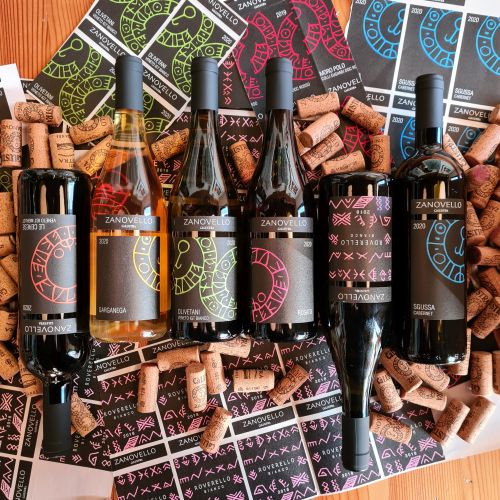
Zanovello labels
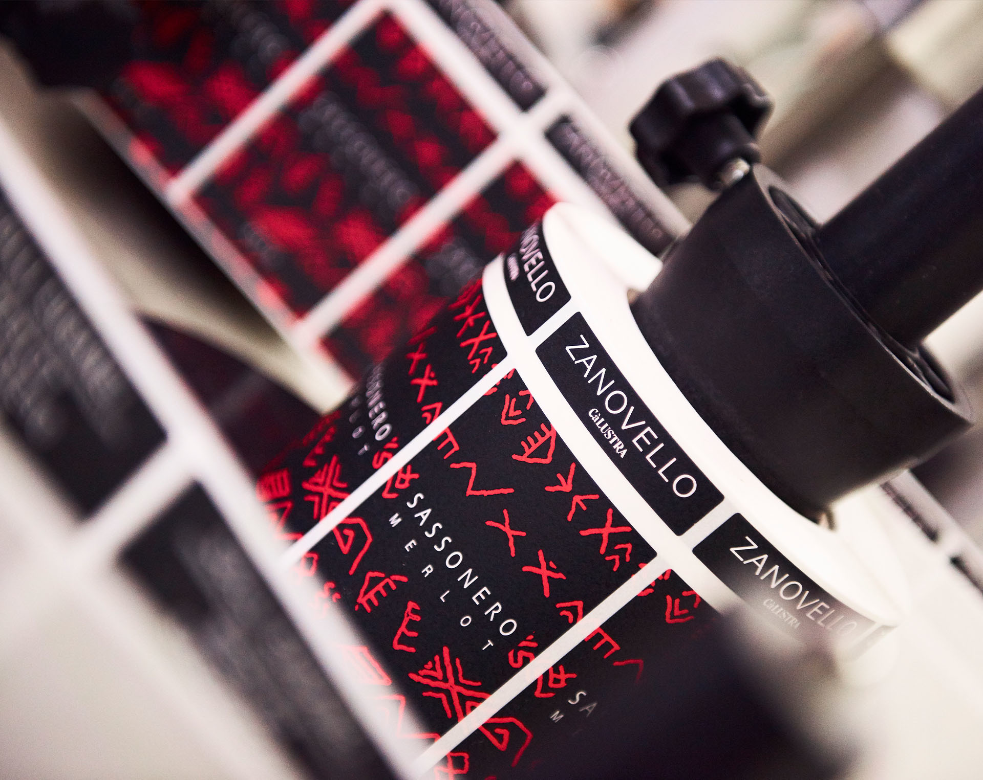
Those who enter the winery immediately notice our distinctive labels. Many ask if the symbols they bear are ancient Egyptian, Etruscan, Celtic or Phoenician characters. In reality, those are characters of the Venetic alphabet, used by pre-Roman Venetic populations between the 6th and 2nd centuries BC.
We created these labels in the late 1990s, in collaboration with our friend, architect Fernanda Ferraresso. It took two years of research and testing, but ultimately the first bottle of Sassonero with the new label came out in 2000: red characters on a black background.
If you want to learn more about the history of our labels and their evolution over time, read the article The Ca' Lustra Zanovello labels.
Over time, they underwent subtle changes, but after more than 20 years we still find them beautiful.
To every wine its color
When we prepare a wine tasting, we also briefly discuss the fanciful names on the bottles, which are often the results of long research.
But what about the colors on the label? Indeed, we rarely take a moment to introduce them. Let us give you a little taste with just a few examples. Purple is for Marzemino, a grape that gives wine an intense color with violet hues. Yellow is for the warm Moscato, with its golden berries brightened by the sun. Red is for the Sassonero, powerful and enveloping. Blue is for the Girapoggio, austere and dense. If we piqued your curiosity, visit us at the winery and we will be happy to tell you more about each choice.
A different color for each wine then. But, what if one day we decided to create a new wine, and wanted to avoid confusing labels with subtle shadings of blue, turquoise, violet or cyclamen?
The new that looks back at the origins
In 2020, we added 3 new products to our selection: Le Cerese, Sgussa and Garganega. The designs we created for them was always meant to be a temporary one, a patch barely masking our excitement in introducing these wines to the public. Now, the more we look at the shelves the more we feel the need for a more harmonious label, which would align the latest arrivals with the more established bottles of the Zanovello line.
Thus, we reached out to Francesca Forte, the creator of the labels for the Author’s Proof project. With patience, inventiveness and empathy, she went back and forth with a series of proposals, until together we found the right solution: a triptych. Or actually two…
The winning proposal
In reimagining our labels, we tethered some bottles together: Garganega, Olivetani and Rosato for one tryptic and Sgussa, Moro Polo and Le Cerese for the other. By placing the three bottles next to each other, you will be able to appreciate the ensemble design, revealing our complete logo. Akin to a jigsaw puzzle. Black background and colorful symbols. Bright colors calling back to the grape variety or a specific feature of the wine. Highly recognizable labels reminiscent of the now historic Zanovello line. This was clearly a winning proposal.
6 + 1
6 + 1? That’s right, 6 new labels + 1. The forerunners of our renewal are the six wines we just discussed, but one more bottle has been longing for our attention for some time: the Roverello. Roverello always sported a somewhat dark label, which seemed to diminish its importance and we wanted to make it pop. Almost every time we would print the labels for a new vintage, we would look for alternatives, without success. This year, after several iterations, we finally found a new look for this great Chardonnay: it is an intense and delicate wine, elegant, assertive, but also delicate. Pink shall be the color for the new label.
The levity of form
Among other new features detailing our wines you might notice how light the bottles are.
In the common perception, great wines should come in weighty glass bottles. But are we sure it has to be that way? Can the weight of the glass really change the wine contained within it? And how do the production and transportation of heavy bottles reflect on the environment?
It has been difficult to find the right format, especially with the increased complexity in sourcing of raw materials we experienced in recent years. But we finally settled for a satisfactory solution, with lighter bottles for even the most important reserves, without impacting the quality of the wine within. We invested the gains of these evolution in even better performing corks, in order to ensure the best possible results when you decide to consume our wines many years from now.
We see this as a win-win situation: we can provide higher quality, you can confidently assemble and store your personal reserve, all without excessive environmental burden.
If you want to find out more about our projects, come visit us at the winery, we are open every day.